AI Slop Looks Like Your Local Weather Forecast Now
Fake storm maps and disaster images copy the graphics people already trust. Platforms reward the recognition hit long before anyone checks who issued the forecast.
August 11, 2026 · 8 min read
In October 2024, as Hurricane Milton crossed Florida, an image circulated that appeared to show the approach to Cinderella Castle at Walt Disney World under brown floodwater. The scene was fabricated. Fact-checkers traced versions of the picture through social posts, while reporting and images from the resort contradicted the supposed devastation.
The fake still made emotional sense at phone size. A famous landmark was visible. The water looked dirty enough. The sky had received the full disaster preset.
It arrived among real evacuation updates, radar loops, storm footage and television clips, where a viewer had to decide whether to believe it before scrolling to the next thing.
That Cinderella Castle image is useful because it shows where AI slop has moved. The generator does not need to produce a flawless photograph. It needs to produce something that fits the feed around it, then borrow enough cues from weather coverage that viewers classify it as an update rather than an illustration. The job is recognition.
Inspection can come later, if it comes at all.
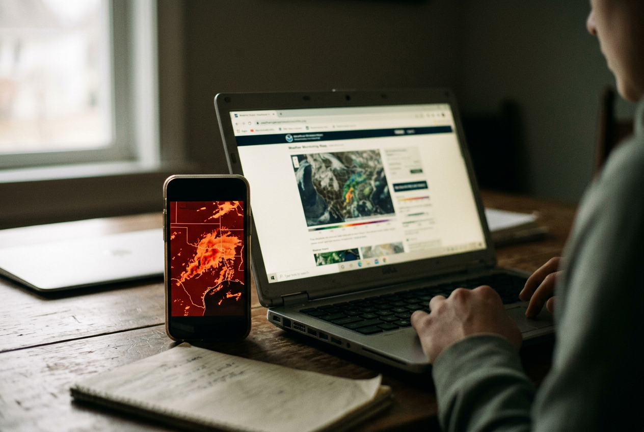
Fabricated forecast maps push the same trick further. They use the visual furniture of a local-news weather hit: a station bug, the small logo fixed in a corner; a radar palette moving from green through yellow toward red; county outlines; all-caps alert language; a cone, arrow or alarming number placed where a meteorologist would usually stand. Even when the geography buckles or the labels turn to alphabet soup, the package says weather before the details say nonsense.
The format gets there first
Local television spent decades teaching viewers how severe weather should look. The map fills the screen. A lower-third banner names the threat. Red means stop pretending this is background noise.
The meteorologist points at your county, then the station cuts to a commercial for windows.
That repetition created visual authority that belongs partly to public weather infrastructure and partly to private station branding. National Weather Service offices issue forecasts, watches and warnings. Television stations translate much of that material into house colors, animated radar and urgent typography, adding reporting and local context. A fake can skip the forecasting work while keeping the costume.
Radar imagery is especially easy to imitate because viewers rarely read it as measurement. Weather radar records reflectivity, meaning the amount of transmitted energy returned by precipitation and other objects, then software renders those values as colors. The familiar green-yellow-red progression feels standardized even though palettes, products and scales can differ. A generated map only needs the broad color logic.
Put an angry red mass near a recognizable coastline and the eye supplies the storm.
This is cognitive fluency, the tendency to accept information more readily when its form feels familiar and easy to process. The phrase sounds like homework. The experience does not. You see the logo, the map and the warning bar before you notice that one town has migrated across the state line.
The Cinderella Castle flood image carried no forecast worth evaluating. It still benefited from the same learned sequence: hurricane coverage, ominous picture, recognizable place, urgent repost. By the time a fact-check added context, the fake had already completed its main task. It had become a tiny piece of somebody’s weather reality.
AI does not have to understand weather
Image generators can reproduce the surface of a forecast without knowing whether a storm track, pressure reading or county boundary makes sense. Text-to-image systems build pictures from statistical relationships learned across large collections of images and captions. They are good at the recurring arrangement of a genre. They are less dependable when every label, contour and geographic relationship must remain exact.
That mismatch is almost ideal for slop production. A person can prompt a dramatic hurricane map, add a broadcaster-style logo in an editing app, crop the result vertically and publish several variants while a real storm is still dominating search and recommendations. The labor cost is low. The visual template has already been built by institutions that spent years earning trust.
Some fakes announce themselves through mangled place names, impossible coastlines or warning text that reads like a refrigerator magnet having a panic attack. Others use a real radar screenshot and alter only the headline or projected path. That version can be harder to catch because most of the pixels are authentic. The lie sits in the annotation.
Screenshots make the problem worse. They flatten source material into a single image, stripping away links, captions and much of the context that could show where the graphic originated. Repeated compression also softens lettering and small errors, which means the same low resolution that makes a post look cheap can make its defects harder to inspect.
The Castle image did not need to survive a forensic lab. It needed to survive a thumb.
The feed pays for speed, not issuance
Weather misinformation used to need a rumor, an old photograph or a mislabeled video. Generative tools add cheap variation. One operator can produce different maps, flooded landmarks and storm scenes, then test which version draws the strongest response. Accounts can also recycle a winning image with a new location in the caption.
Recommendation systems, the software that selects and orders posts for each viewer, usually have strong signals for attention and weaker signals for meteorological legitimacy. A frightening image can collect comments, shares, rewatches and outraged corrections. Those reactions tell the system that people are stopping. They do not reliably tell it that the storm track was invented.
The money arrives through several routes. Eligible creators may receive platform payouts or advertising revenue. Pages can build audiences that later funnel toward subscriptions, affiliate links or other content. Some posts function as follower bait rather than direct income, which still gives the operator an asset to monetize or redirect.
The individual fake can be disposable because the account keeps the attention.
Short-form video makes station cosplay even easier. A creator can animate a generated map, place it behind an authoritative voice-over and add captions in the blocky style used for alerts. The clip may be reposted without its original caption, stitched by another account or screen-recorded into a compilation. Each hop weakens the source trail while preserving the red radar blob.
Platforms do label some synthetic media and restrict harmful misinformation, but enforcement has to identify the post, interpret its context and act before the distribution spike ends. A label attached after a fake has spread is a correction stapled to an empty display rack.
Branding becomes an attack surface
A station logo once helped answer a basic question: who is telling me this. In a repost economy, the same logo can become evidence supplied by the fraud itself. Viewers recognize the design faster than they verify whether the station published the image on its own site or account.
This is an attack on institutional formatting as much as factual content. The faker borrows a broadcaster’s visual authority while platforms detach the graphic from the broadcaster’s distribution channel. A station may correct the image, yet the correction competes as another post rather than replacing the counterfeit wherever it appears.
The distinction matters during disasters. A fake entertainment image wastes attention and can distort public understanding of damage. A fabricated warning map can send people toward the wrong information while roads, shelter plans and evacuation decisions are changing. Even a fake that exaggerates danger can erode trust when viewers later discover the deception, leaving real alerts to fight through the residue.
The flooded Cinderella Castle picture was built around spectacle, but its circulation followed the same route as practical weather information. That is the deeper problem. Feeds place official warnings, local reporting, synthetic disaster scenes and engagement bait inside nearly identical rectangles, then ask viewers to perform source verification while frightened or distracted.
Verification has to follow the issuer
The quickest useful check is outside the post. Find the claimed station’s website or verified account and look for the same graphic. For US warnings, check weather.gov and the relevant National Weather Service office.
A real alert should have an issuing body, a stated area and a time window that can be matched against official information.
Maps deserve a close look at labels, borders and timestamps, but visual artifacts are no longer a sufficient test. Genuine images can look strange. Synthetic ones can look clean. Source continuity matters more: who first published the item, whether local outlets corroborate it and whether the picture appears only through screenshots from aggregation accounts.
Content provenance, a record of where media came from and how it was edited, could help when cameras, publishers and platforms preserve it. Standards such as Content Credentials can attach that history to a file. They cannot solve the problem alone because screenshots and re-uploads may remove the record, while many legitimate local outlets lack a complete workflow for adding it.
Platforms could add friction where the stakes are clearest: limit recommendation of unlabeled synthetic disaster media, preserve origin labels across reposts and place official local alerts directly beside viral weather claims. That would cost engagement and require rapid regional moderation. It would also stop outsourcing the entire verification job to the person checking a flood map with one hand while packing a bag with the other.
The practical lesson from the Cinderella Castle fake is not that every dramatic image needs pixel-level detective work. Open the issuer. The castle can wait.
Questions people ask
How can
I tell whether a weather map is AI-generated?
Start with the source rather than the artwork. Check whether the station, National Weather Service office or other named issuer published the same map through its official site or account. Misspelled towns and broken borders are warning signs, but clean typography does not prove authenticity.
Why do fake forecast graphics look convincing on a phone?
Small screens reward the overall template: logo, radar colors, alert banner and recognizable location. Compression hides fine errors, while fast scrolling gives viewers little time to compare labels or geography. The format is processed before the source, especially when the post arrives among genuine storm updates.
Who benefits from AI disaster slop?
Accounts can collect ad revenue or platform payouts where eligible, but direct payment is only part of the incentive. Viral disaster posts also build followers, drive traffic and train recommendation systems to keep distributing the account. The public absorbs the verification cost, and local outlets must spend reporting time correcting a counterfeit.
Are official-looking logos enough to verify an alert?
No. Logos can be copied, pasted onto altered radar images or generated as part of a fake graphic. Treat branding as a claim about origin, then confirm that claim by visiting the named outlet or weather agency directly. During an active emergency, use official alerts rather than a reposted screenshot.
One update a day
Today's story, in your inbox
One story each morning — no hype, no filler, no algorithm deciding for you.