TikTok Carousels Turn the Last Slide Into a Retention Trap
A controlled test with one battered sneaker shows how TikTok turns still photos into timed attention traps, and why “use more slides” is folklore, not an algorithm cheat code.
August 29, 2026 · 8 min read
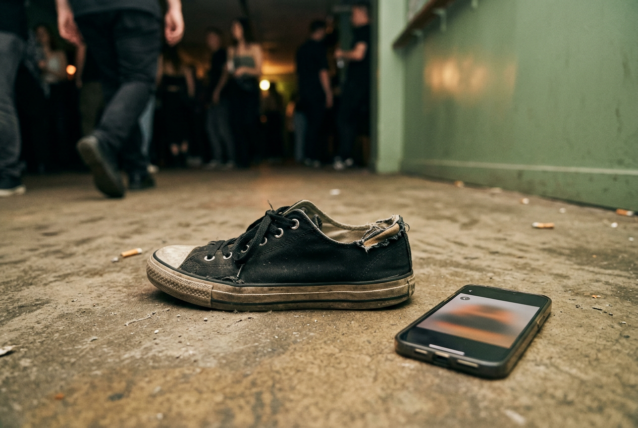
The test subject was a black cotton-canvas sneaker with rubber foxing and a hole worn through the inner heel lining. From the outside, it looked merely tired. The damage appeared only when the collar was pulled forward, which made the shoe perfect carousel bait: an ordinary object with one fact that could be withheld.
I built several versions of the same post in TikTok’s photo mode, using the same images, caption and cover. One opened with the torn lining. Another saved it for the seventh and final slide. A shorter version cut the sequence to four images.
Music was added, muted and swapped while each version was posted with its audience set to Only you, then viewed repeatedly through the standard interface.
This was not an attempt to reverse-engineer TikTok’s recommendation system, the software that selects and orders posts for each viewer. A private post cannot reveal distribution, while public variants would face different viewers, timing and early reactions. The useful evidence sat closer to the glass: what the interface timed, what it counted, what it encouraged me to do and which creator superstitions it could not prove.
The sneaker test
In the seven-slide version, the first image showed the sneaker from the side. The second moved closer to the rubber edge. Later frames showed the insole, creased toe and damp-looking canvas. The final image exposed the hole.
Nothing about those middle photographs was necessary for understanding the damage. Their job was to create distance between premise and payoff.
That distance changed the post. With the torn lining first, the remaining slides felt optional because the informational task was finished. With the tear last, every swipe became a small wager that the next image might settle whatever the caption had set up. The object stayed static; the uncertainty moved.
TikTok also auto-advanced the photos while audio played, so refusing to swipe did not stop the sequence. Manual swiping accelerated it. Waiting let the platform set the pace. This combination matters because a carousel can collect time from two kinds of viewer at once: the person actively paging through and the person who has paused long enough for the post to keep moving by itself.
The shorter sequence reached the damage faster and asked less patience from the viewer. It also offered fewer opportunities to swipe or wait. The longer post created more runway, but the extra photographs became obvious padding when they failed to add information. Seven was not inherently better than four.
Seven merely gave the post more chances to retain attention, along with more chances to lose it.
What a swipe proves
Creators often talk about swipes as if each one were a stamped ballot for wider distribution. The interface offers no such receipt.
A swipe is an interaction in the literal sense: TikTok must register it to move between images. That does not establish that swipes carry an independent ranking bonus, nor does it tell us how they compare with time spent, likes, comments, shares, profile visits or an immediate exit. A viewer can swipe because the post is compelling, because the first image is unclear or because they want to get the thing over with. The same gesture can contain opposite judgments.
What the carousel reliably produces is measurable behavior. It has a beginning, an ordered sequence and an end, allowing the platform to observe whether a viewer stays, advances, leaves or encounters the sequence again. Completion rate means the share of views that reach the end of a post. Even without access to TikTok’s weighting, creators can see why completion becomes the obsession: it converts a loose pile of images into a track with a finish line.
The sneaker post made that machinery unusually plain. Slide six showed the undamaged outer heel from close range. It contained almost no new information, but it made abandoning the post feel premature because the expected reveal had not arrived. That frame was weak as an image and useful as infrastructure.
Music gives photographs a clock
Music did not improve the sneaker photographs. It changed the conditions under which they were consumed.
With a track attached, the sequence had an audible duration and an auto-advance rhythm. A viewer arriving halfway through a recognizable phrase could anticipate movement even before touching the screen. Muting the track removed the sound but did not turn the post into a neutral gallery; the carousel still belonged to an interface built around continuous playback and onward motion.
This is where creator folklore outruns the test. A trending sound may place a post near an active body of content, give viewers a familiar cue or make an otherwise thin sequence feel intentional. None of that proves the sound itself commands extra reach. The observable advantage is structural: music supplies pacing, covers dead air and makes waiting for the next photograph feel like participation rather than delay.
For the sneaker, a faster track made the seven slides feel less padded, although no image became more useful. A slower one exposed the stall. Music functioned as timing material. Treating it as an algorithmic blessing confuses what a viewer experiences with what the ranking system secretly values.
The last slide is rented suspense
Saving the torn heel for last increased the reason to finish, but it also made the post less honest.
The distinction rests on whether the middle earns its place. A repair tutorial might need ordered photographs because each stage changes the next. A fit comparison could require several angles before the flaw becomes legible. The sneaker sequence did neither.
It withheld a close-up that could have appeared immediately, then spent six slides charging attention for access.
“Wait for the last slide” is the blunt version. More polished posts use a first-frame claim, numbered images, cropped evidence or captions that promise an eventual reversal. The method survives because completion is easy to desire and difficult to diagnose. If a delayed reveal performs well, the creator credits suspense.
If it fails, they blame the cover, posting time, sound or slide count. The feed provides enough variables to preserve almost any theory.
The cost lands with the viewer in seconds and repeated gestures, which sound trivial until the same design appears across an endless feed. TikTok does not need every carousel to hold you for long. It needs posts to keep presenting tiny unfinished tasks that make leaving feel fractionally less satisfying than one more swipe.
The test cannot produce a magic number
No controlled viewing exercise can identify the ideal slide count because the number is not the mechanism. The relationship among promise, delay and payoff is.
Four slides can drag when the second image settles the point. Ten can move quickly when each changes the story. Adding slides creates inventory for attention, but inventory is not demand. The interface makes completion possible to measure; it does not make completion automatic.
Posting-time claims are even harder to separate from noise. Public feed distribution changes with the audience receiving a post, their behavior, competition in the feed and TikTok’s own testing of material. Two visually identical uploads are not controlled experiments once recommendation begins. Creators can compare results, but declaring that Tuesday evening or an odd-numbered carousel “worked” turns one outcome into policy.
The hands-on test supports narrower conclusions. TikTok’s photo mode can auto-advance. It records navigation. Audio imposes pacing.
Ordered slides let creators delay information. Those are interface mechanics. Claims that a certain number of photographs, a specific sound category or repeated swiping guarantees promotion remain folklore unless TikTok discloses the weighting or a broader independent study isolates it.
Attention does not guarantee payment
A carousel that holds viewers can support the wider creator business: sponsored posts, affiliate links, product sales or traffic to a profile. That does not mean every completed carousel triggers direct platform payment. TikTok’s monetization rules vary by program and can favor particular formats, lengths or eligibility requirements.
The platform still benefits from attention that produces no creator check. More time inside the feed gives TikTok more opportunities to recommend another post, gather behavioral signals and place advertising elsewhere in the session. The torn sneaker does not need to earn money itself. It needs to keep the machinery warm.
For creators, this creates an ugly incentive. A concise post may respect the audience and surrender measurable duration. A padded one can manufacture more opportunities for interaction without contributing more meaning. The interface cannot distinguish suspense from stalling by looking at a swipe alone.
Questions people ask
Do more slides make a TikTok carousel perform better?
More slides create additional opportunities for watch time, swipes and completion, but they also create more exit points. The test showed no inherently superior count. A longer sequence works only when the initial promise remains unresolved or each image contributes enough information to justify another gesture.
Does
TikTok boost photo carousels that use trending music?
The interface test cannot prove a direct ranking boost. Music gives the carousel pacing, supports auto-advance and may make the format feel native to viewers, all of which can affect behavior. That behavioral effect should not be confused with evidence that TikTok awards a fixed bonus for using a popular track.
Does swiping count as engagement on TikTok?
TikTok necessarily registers swipes to navigate a carousel, but the interface does not disclose whether each swipe carries independent ranking weight. Swiping can indicate curiosity, confusion or impatience. Time spent and reaching the final slide reveal more about retention, although their precise role in recommendation remains undisclosed.
Why do creators hide the important image at the end?
A withheld final image gives viewers a reason to continue through material they might otherwise skip. In the sneaker test, six frames delayed the torn heel without explaining it. The tactic can raise the chance of completion, but when the middle adds nothing, the creator is charging attention for information already available in one photograph.
One update a day
Today's story, in your inbox
One story each morning — no hype, no filler, no algorithm deciding for you.